
THE STYLE
Fatter than ever
A fat face is a Didone-style serif letter with an extremely bold design. Typographic historian John Lewis called it "the first real display typeface".
Walk the timeline
A HISTORY OF BOLD TYPE
c. 1810 London's loudest letters
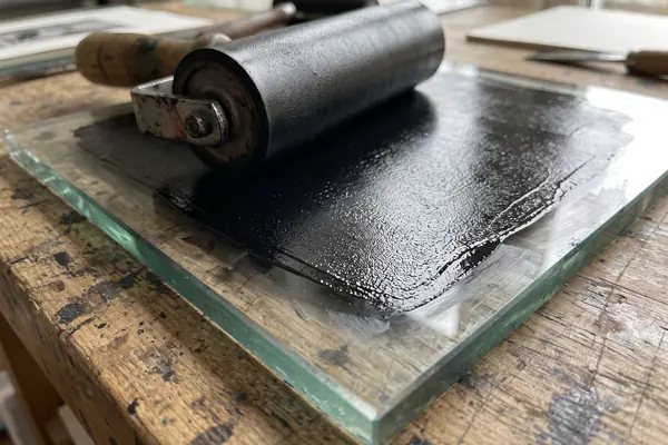
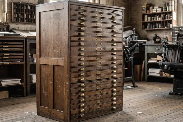
AI-generated image, not a photograph of a real person or place.
In typography, a fat face is an extremely bold letter with very thick verticals and very thin hairlines.
It appeared in London around 1805 to 1810, as printers needed louder letters for posters and handbills. This independent guide tells its story from typographic history and a working printing museum, and is about letters only.
THE SHORT ANSWER
Book type was built for reading close up.
Three things that changed that.
THE STYLE
A fat face is a Didone-style serif letter with an extremely bold design. Typographic historian John Lewis called it "the first real display typeface".
Walk the timelineTHE TRADE
Writers in 1822 and 1825 credited London typefounder Robert Thorne with bringing fat types into posters and jobbing print.
How to spot oneWOOD TYPE
Large metal type could crack as it cooled, so big letters were cut from wood. By 1828, machine-made wood type was half the cost of metal.
How wood type worked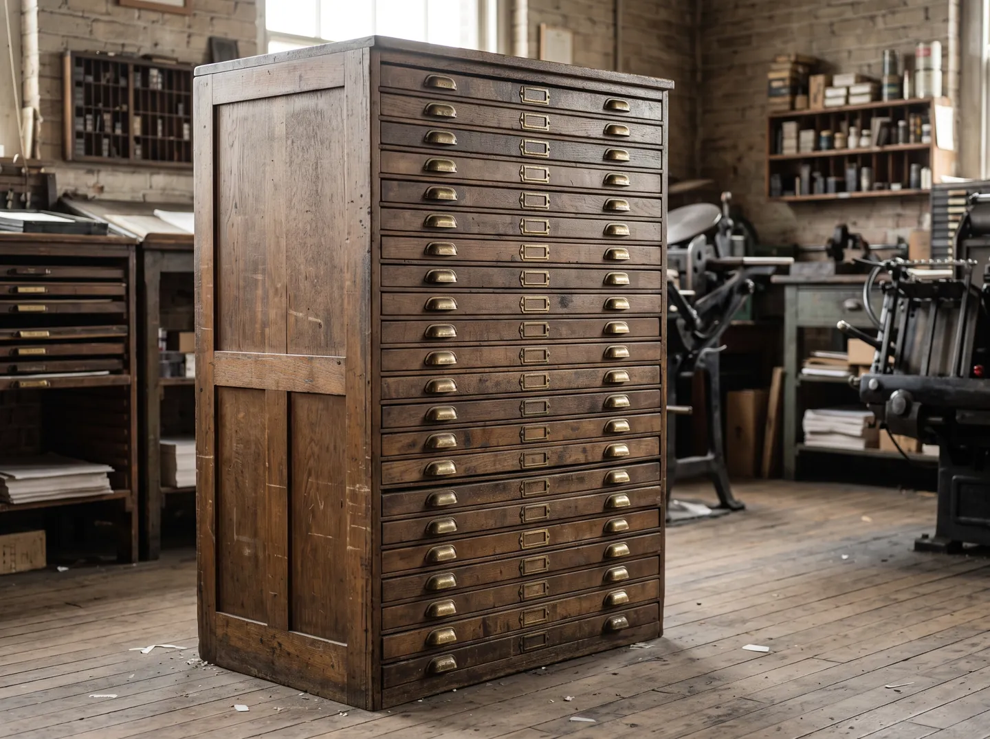
HOW TO SPOT A FAT FACE
Four things to look for on an old poster, a shop front or a gravestone. The same style was also painted and carved as lettering, not only printed.
The verticals are made extremely heavy, much thicker than in ordinary book type.
Historian James Mosley noted that while the thick lines were very thick, the thin ones stayed very thin indeed.
Unlike slab serif type, which came soon after, a fat face keeps its serifs fine rather than making them bold.
Fat faces came in italics too, often with swash capitals, and with white lines, patterns, fruit or flowers inside the strokes.
TWO NUMBERS WORTH KNOWING
One figure for when fat faces appeared,
one for what wood did to the price of big letters.
1805–1810
Fat faces appear in London
Fat face typefaces appeared in London around 1805 to 1810 and became widely popular, issued in very large poster sizes.
FIRST APPEARANCE
½ the cost
Wood type against metal, 1828
Darius Wells of New York published the first known wood type catalogue in 1828, saying wood type was half the cost of metal type.
WOOD TYPE · HAMILTON MUSEUM
Thorne's own role is hard to prove: few type specimen books from his foundry or his rivals survive, so later historians treat the contemporary credit with some caution.
A QUICK TIMELINE
Pick a date to see how poster lettering changed. The bar shows how heavy the letters had become.
Based on Wikipedia's sourced history of fat face type and Fonts In Use. The bar is our simple summary.
WOOD TYPE
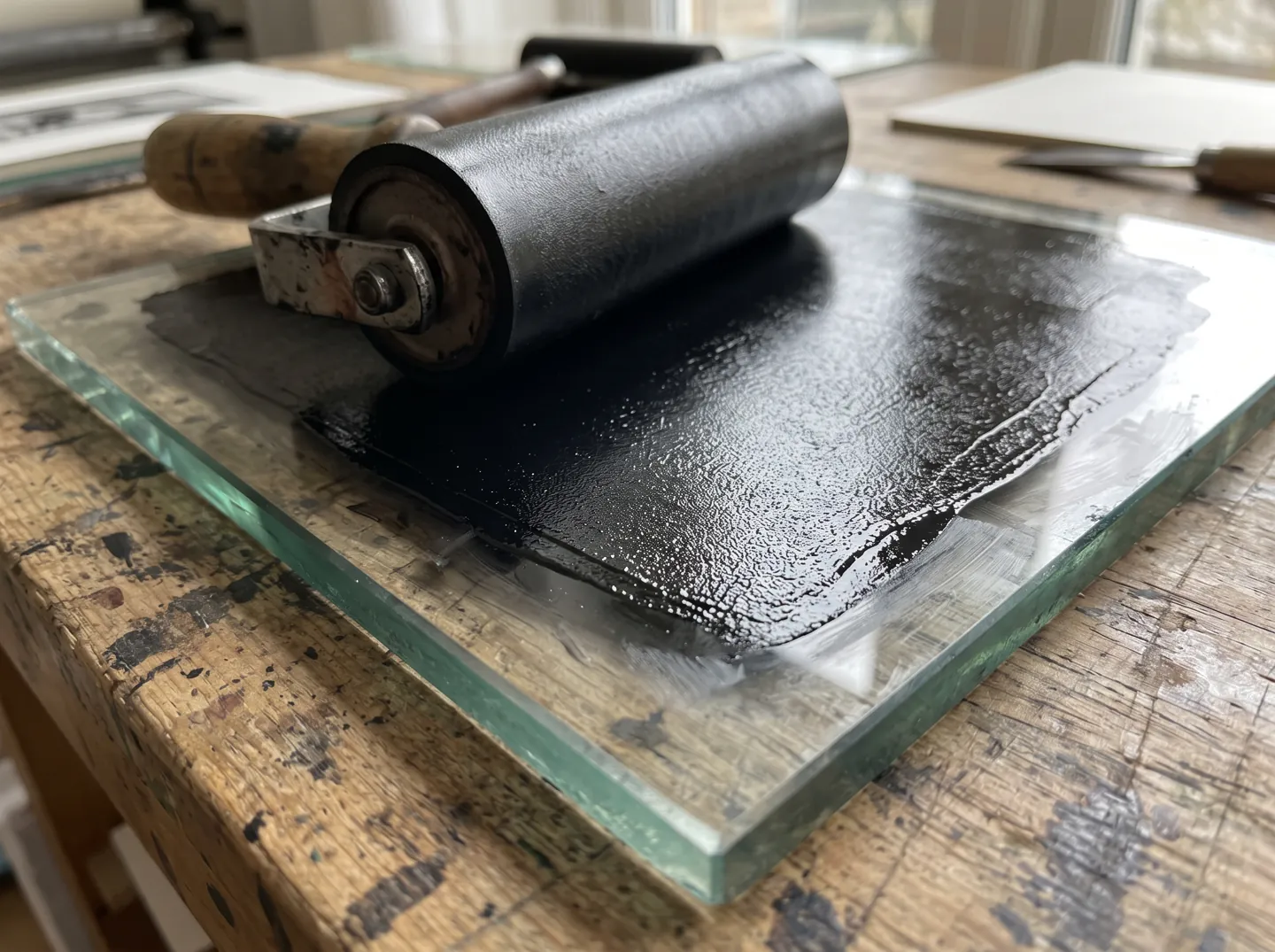
The Hamilton Wood Type and Printing Museum explains that in Europe very large letters were carved from wood, because large metal type tended to crack or develop uneven surfaces as it cooled.
Darius Wells of New York found a way to mass-produce wood letters in 1827, using a lateral router. In 1834 William Leavenworth added the pantograph, and together they formed the basic machinery for making wood type in quantity.
In conversation
A serif typeface or lettering in the Didone or modern style with an extremely bold design: very thick verticals and very thin horizontals. It appeared in London around 1805 to 1810.
Writers in 1822 and 1825 credited the London typefounder Robert Thorne, of the Fann Street Foundry. Few specimen books survive, so historians say his exact role is hard to confirm.
Printed posters and advertising grew fast in the early 19th century, creating demand for eye-catching letters. Fat faces' extreme design had an immediate impact on display typography.
No. Slab serifs appeared shortly afterwards and make the serifs themselves bold. A fat face keeps hairline serifs and thin horizontals.
Large printing letters cut from wood. The Hamilton Wood Type Museum says Darius Wells began mass-producing them in 1827 and published the first known wood type catalogue in 1828.
Each figure on this page comes from the sources below.
ABOUT THIS NAME
doodlefatface.com is part of the DoodleSale portfolio. It isn't in an auction right now, but you can ask about leasing it.